
Designing a Website That Builds Trust & Patient Enquiries
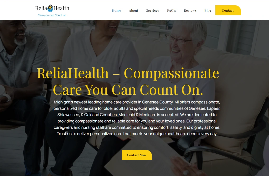
ReliaHealth Home Care needed a cleaner, more professional website experience that could better communicate its senior care, skilled nursing, respite care, and in-home support services to families in Genesee County and nearby areas. The goal was to create a trustworthy, easy-to-navigate website that clearly explains services, reduces friction for visitors, and encourages more local enquiries through calls, contact forms, and care assessment requests.
A Well-Structured Website Built to Convert
Key Problems and the Solutions We Implemented
We focused on improving clarity, trust, user flow, and conversion paths so local families could understand the services faster and take action with confidence.
| Problems | Solutions |
|---|---|
| 1. The website lacked a strong first impression for families searching for senior care or home care services. | We redesigned the hero section with stronger messaging, trust-focused copy, clearer service positioning, and more prominent calls to action to instantly communicate what ReliaHealth offers and who it serves. |
| 2. Important services were not structured in a way that made decision-making easy for local families. | We created a cleaner service layout with improved hierarchy, better visual grouping, and clearer descriptions so users could quickly understand senior caregiving, skilled nursing, respite care, and in-home assistance options. |
| 3. The site needed stronger trust signals to reassure visitors before they contacted the business. | We improved trust-building elements by giving more visibility to reviews, professional service positioning, accepted payment options, local presence, and caregiver credibility throughout the site experience. |
| 4. Contact actions were not prominent enough for users who wanted to call or request care quickly. | We optimized CTA placement across key sections, making phone, contact forms, and care assessment requests easier to find on both desktop and mobile. |
| 5. The website structure did not guide users smoothly from awareness to enquiry. | We improved page flow and content sequencing so visitors move naturally from service understanding, to trust-building, to enquiry actions without confusion or unnecessary friction. |
| 6. Mobile visitors needed a simpler and more readable browsing experience. | We refined spacing, card layouts, tap-friendly buttons, and section readability to ensure caregivers and family members browsing on mobile could navigate quickly and take action with ease. |
| 7. The website needed to better support local patient acquisition, not just look visually better. | We aligned the design around local conversion intent by emphasizing service areas, care types, local trust cues, and high-visibility contact pathways to help attract more relevant local enquiries. |
What Changed After the Redesign
The redesign created a stronger digital first impression for ReliaHealth, improved service clarity for families seeking home care, and built a more conversion-focused user journey. The result was a more trustworthy local healthcare website that better supports calls, enquiries, and care assessment requests from potential patients and their families.
Stronger First Impression
The new design immediately communicates professionalism, compassion, and credibility—critical for senior care and home health decision-making.
Improved Service Clarity
Visitors can now understand care options faster, making it easier for families to identify the right support services without confusion.
Higher Local Trust
Better content structure, clearer service messaging, and stronger trust signals help local families feel more confident reaching out.
More Visible CTAs
Calls, contact forms, and assessment requests are easier to access throughout the site, helping reduce drop-off before enquiry.
Mobile-Friendly UX
The experience was refined for mobile visitors, making it easier for caregivers and family members to browse and take action on smaller screens.
Built for Local Lead Growth
The website now supports local patient acquisition more effectively by combining better UX, stronger trust, and clearer conversion pathways.